UNPACKING HORROR VACUI
In design and marketing, there are clear distinctions between minimalist and maximalist approaches, or between clean and cluttered presentations. One notable concept in this context is Horror Vacui, the aversion to empty spaces. Let's explore this age-old idea and its relevance today.
THE ORIGINS
Horror Vacui, a Latin term evoking the "fear of emptiness", has roots that stretch far back in time. Philosophers like Aristotle hinted at concepts akin to this, but today, its essence is channeled into a distinctive style of art and design, one that doesn't permit even a hint of empty space. The paradox is palpable. In a world where minimalism has found favor in many quarters, this style thrives in its maximalist glory.
PRESENT DAY CHRONICLES
Flip through a newspaper, and you'll witness Horror Vacui in action. Same with comic books, where every fragment tells a tale, or cluttered websites that scream for your attention.
THE VALUE PERCEPTION PARADIGM
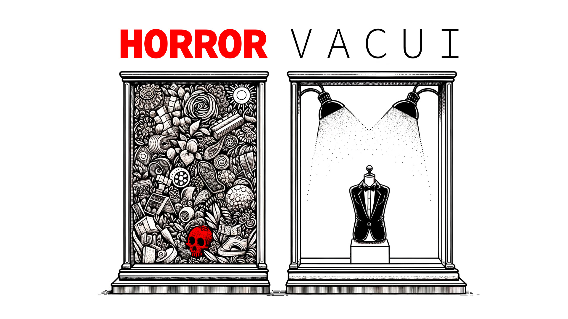
As the intensity of Horror Vacui increases, its perceived value often decreases. This trend is evident in retail displays. More cluttered window displays tend to correlate with products at average or lower price points, indicating a lower brand prestige.
THE PITFALLS OF HORRO VACUI
- Loss of Focus: Overloading an audience can detract from the main message. If everything screams for attention, nothing stands out.
- Reduced Legibility: Especially in print and web design, overcrowding can make content hard to read or navigate.
- Paralysis of Choice: In marketing, bombarding consumers with too many options or messages can lead to indecision.
- Perceived Lack of Value: A cluttered design might be perceived as cheap or of lower quality.
CONTRASTS IN COMMERCIAL DESIGN
High-end brands paint a different picture. Their canvases are marked by minimalism, hinting at exclusivity and premium offerings. While opulence is associated with Horror Vacui in some cultural contexts, in commercial design, it often signals affordability.
KEY TAKEAWAYS
¬ Historical Roots: Horror Vacui isn't a fleeting trend; its origins are ancient.
¬ Ubiquitous Presence: From newspapers to digital platforms, Horror Vacui finds representation everywhere.
¬ Perceived Value: An increased intensity of Horror Vacui can impact a brand's perceived value.
¬ Design Contrasts: While luxury leans towards minimalism, budget-friendly options often embrace Horror Vacui.
¬ Intentional Use: Use Horror Vacui deliberately, understanding its implications on audience perception.
FINAL THOUGHT
Design principles, no matter how contradictory, coexist. They cater to varied audiences and serve different purposes. As designers and marketers, the challenge lies in discerning which principle to employ, when, and how. Embrace the void, or fill it to the brim—just ensure the choice is informed and intentional.
