THE POWER OF CHOICE IN USER EXPERIENCE DESIGN
In the world of User Experience (UX) design, understanding human behavior is paramount. One such behavioral principle that plays an influential role in design decisions is Hick’s Law. Named after British psychologist William Edmund Hick, this law provides valuable insights into how choice and decision-making time are correlated.
ORIGIN OF HICK’S LAW
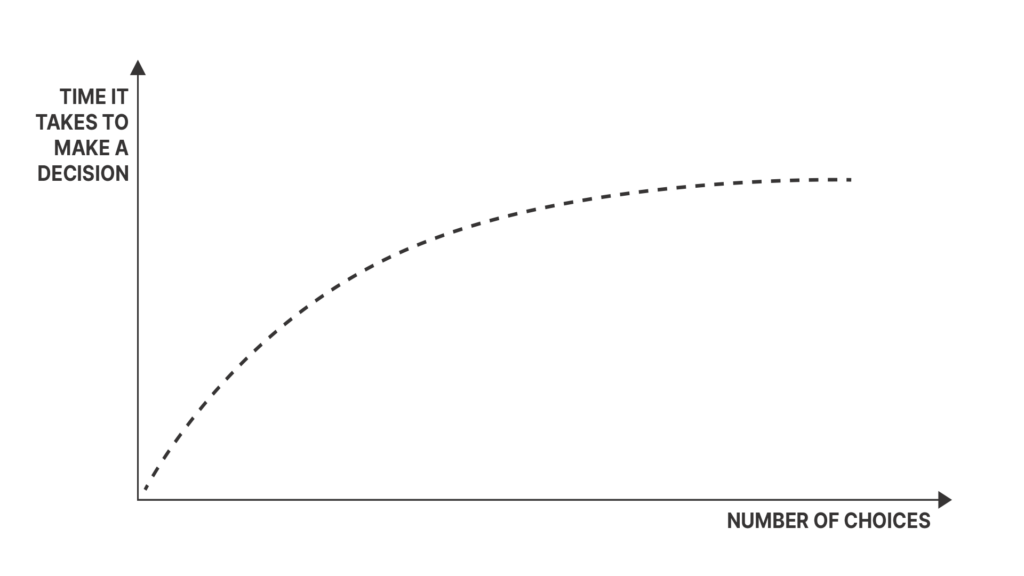
Hick’s Law emerged from studies conducted in the 1950s by William Hick and Ray Hyman. Their research aimed at understanding the relationship between the number of stimuli presented and an individual’s reaction time to make a choice among them. The primary conclusion was straightforward: the more choices a person has, the longer it will take them to make a decision.
The fruits of their labor yielded a profound insight: As the number of choices increase, the decision making time also increases, albeit logarithmically. This principle was crystallized into Hick’s Law, represented by the formula:
RT = a + b log2 (n)
- RT stands for the total reaction time.
- a & b are constants contingent on the task and conditions.
- n is the number of choices.

The implications of this formula are profound, especially when combined with the concept of cognitive load.
COGNITIVE LOAD: THE LENSES OF UNDERSTANDING
Cognitive load speaks to the mental effort required by an individual to perform a task or process information. When intertwined with Hick’s Law, it provides a richer context to the simple premise that more choices equal longer decision times. In essence, more choices don’t just tax our time but our cognitive capacities too. The brain isn’t just a decision-making tool; it’s a powerhouse of processing, and each decision it encounters is a task that requires resources.
Let’s illustrate this with a simple example: Imagine you’re at a restaurant. A menu with 5 dishes is likely easier to decide upon than one with 50 dishes. Hick’s Law tells us that the decision time will be longer with 50 dishes. Now, bring in cognitive load. With 50 dishes, your brain is not just deciding based on preference, but it’s juggling taste profiles, remembering past experiences, considering health implications, and more. The cognitive load is substantially higher.
WHAT HICK’S LAW MEANS FOR UX DESIGN
In the context of UX, Hick’s Law can be viewed as a cautionary tale against overwhelming users with too many choices. A higher number of choices means more cognitive load, leading to longer decision-making times, potential decision paralysis, or even abandonment of a task altogether.
KEY TAKEAWAYS
¬ Optimize Choices for Swift Responses: Lessen options when quick decisions are vital for better user responsiveness.
¬ Segment Tasks for Clarity: Divide intricate tasks into manageable steps to lighten the cognitive burden.
¬ Guide Users with Highlighted Recommendations: Prevent decision fatigue by spotlighting suggested choices.
¬ Adopt Gradual Onboarding: Introduce features step-by-step to reduce initial cognitive demands for newcomers.
¬ Balance Simplicity and Clarity: Ensure designs are streamlined but avoid over-simplifying to the extent of ambiguity.
FINAL THOUGHTS
Hick’s Law, rooted in historical research, offers a timeless lesson on the impact of choices on decision time. When viewed through the lens of cognitive load, it underscores the deeper psychological implications of these choices. Together, they form a powerful duo that, when harnessed correctly, can shape user-centric designs that stand the test of time.
