Task:
Name, Logo, CI
Client:
IKANGAI is a software company specializing in finding the perfect solution for any problem. IKANGAI offers a variety of services from consulting on digital transformation to conducting AI workshops and implementing software solutions.
Design Idea:
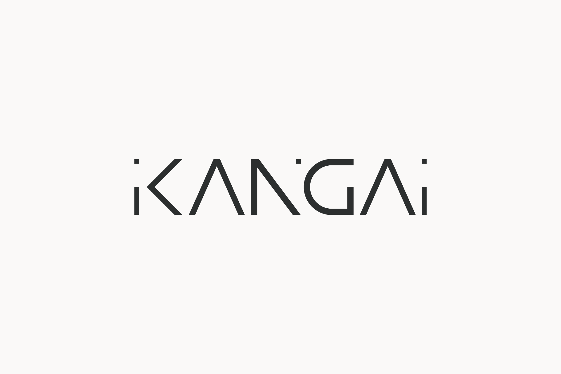
The “IKANGAI” logo derives its name from the Japanese word “iikangaie,” meaning “good idea.” Simplified to “IKANGAI” for easy pronunciation and memorability, the name carries a meaningful story, reflecting the company’s mission to always find the best ideas and to deliver insightful and effective solutions. The logo embodies simplicity, straightforwardness, modernity, and elegance, aligning with IKANGAI’s core values and high standards of quality.
Typography: The logo utilizes a custom typeface that blends sharp angles with smooth curves, striking a balance between dynamism and elegance. This visual duality mirrors IKANGAI’s capability to handle complex tasks with a refined touch.
Color Scheme: The monochromatic black palette is both timeless and sophisticated, exuding professionalism. The color choice ensures the logo is suitable for a wide range of applications, from digital interfaces to printed materials.
Outcome:
The final design communicates IKANGAI’s values—simplicity, straightforwardness, modernity, and elegance. It serves as a visual testament to the company’s mission to provide perfect solutions with a focus on quality and innovation. The logo aligns with IKANGAI’s innovative approach and appeals to clients seeking reliable and sophisticated software solutions.
[Logo]
![[Icon]](https://www.cerridan.com/wp-content/uploads/2024/07/IKANGAI_Logo_bw.png)
[Icon]
![[Icon]](https://www.cerridan.com/wp-content/uploads/2024/07/IKANGAI_K.png)
