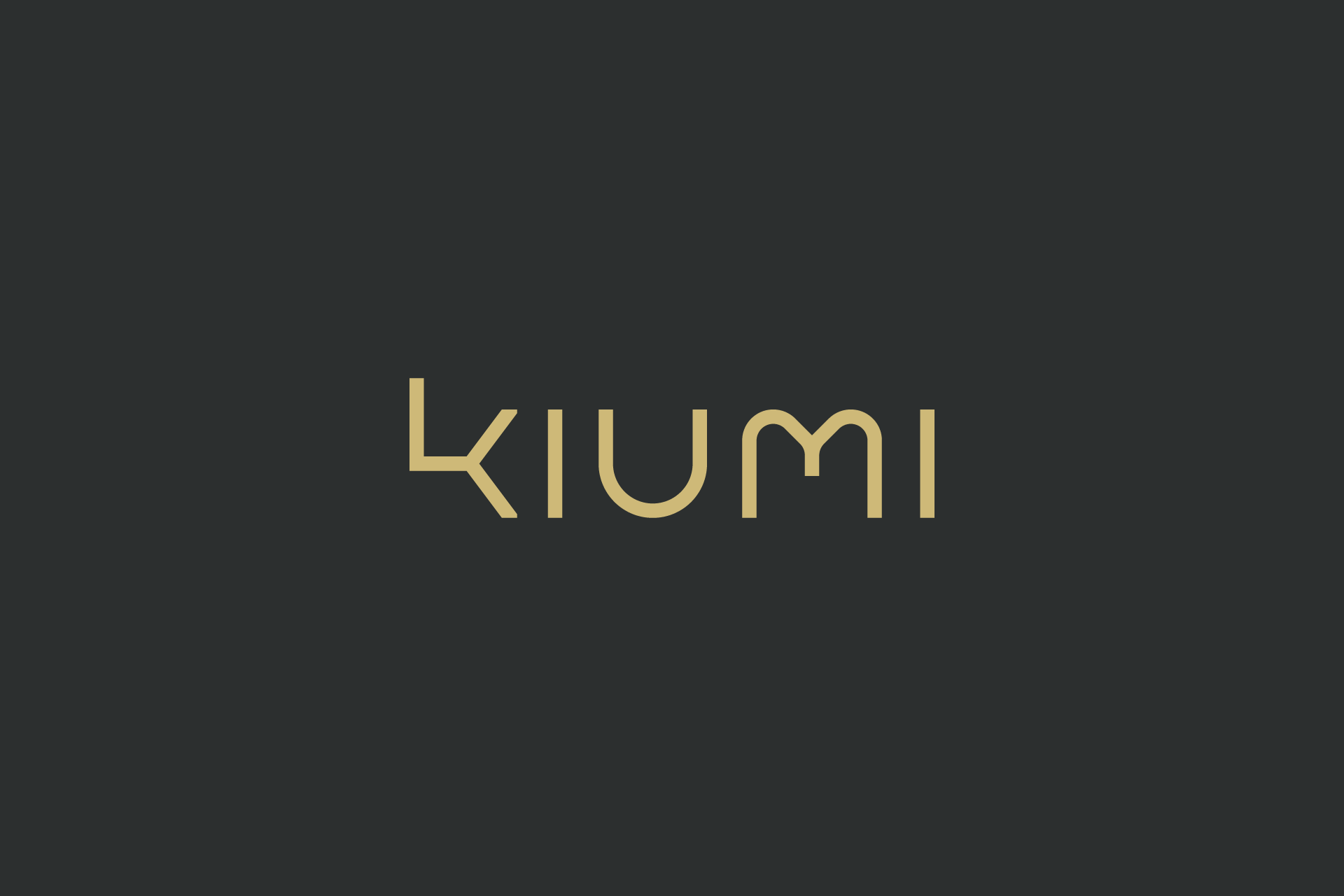
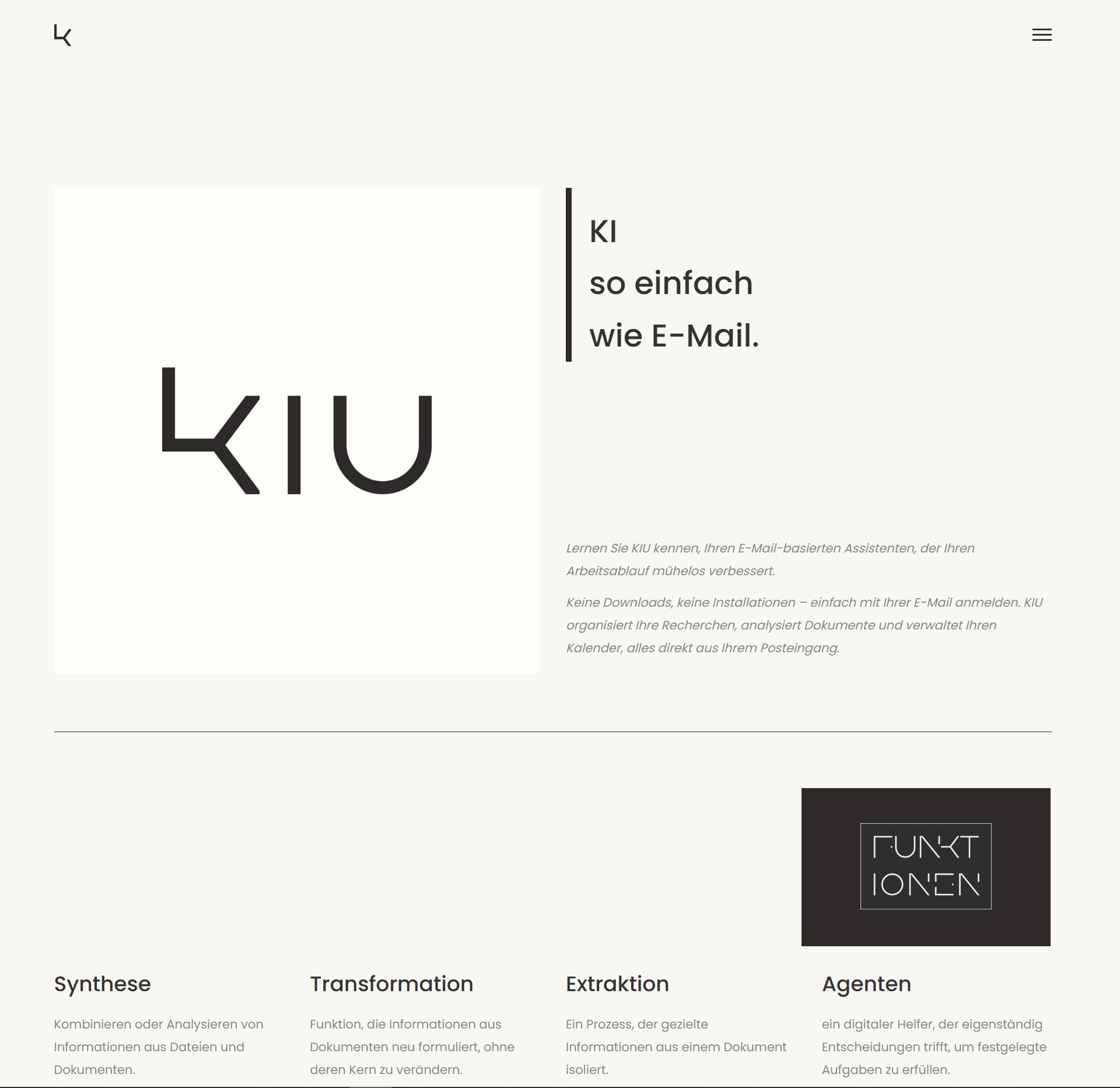
Company name, website and logo that symbolizes the collaborative and supportive relationship between AI and human intelligence, conveying a message of mutual enhancement and coexistence without fear or competition.
Client:
A company specializing in the synergy of artificial intelligence (AI) and human intelligence (HI).
Design Idea:
The “KIUMI” logo is a conceptual amalgamation of the German terms “Künstliche Intelligenz” (Artificial Intelligence) and “Menschliche Intelligenz” (Human Intelligence), with the ‘U’ representing “UND” (and). This design encapsulates the philosophy of AI and HI not just coexisting but collaboratively thriving. The integration of these elements into a single word illustrates the inseparable and balanced partnership that the client aims to achieve through their services.
Typography: The logo utilizes the Edrgo font, chosen for its futuristic appeal and slightly unbalanced form of the letter ‘K’. This intentional design choice symbolizes the necessity of human intelligence to stabilize and complement AI, reinforcing the theme of interdependence.
Color Scheme: Opting for a matte golden hue, the logo exudes warmth, approachability, and exclusivity. This color choice deviates from the typical cold, mechanical associations with technology, instead presenting the AI service as a premium, user-friendly enhancement to human capabilities.
Outcome:
The final design communicates the client’s vision of AI as a valuable and harmonious complement to human effort, rather than a disruptive force. This logo not only aligns with the company’s innovative approach but also appeals to discerning customers seeking sophisticated and supportive AI solutions.
[Logo]

[Icon]
[Website]

