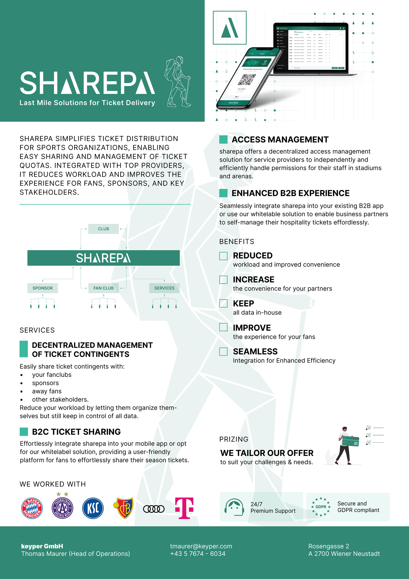
Logo and Flyer Design for SHAREPA (a last mile solutions for ticket delivery) commissioned by keyper Media House GmbH.
DESIGN IDEA
The Sharepa logo merges the robustness of a Sherpa’s spirit with the functionality of modern ticketing solutions. Central to the design is a wireframe mountain climber, symbolizing the intricate network Sharepa navigates to connect various components of ticketing systems. It’s a visual representation of the company’s role in shouldering the complex challenges of ticketing logistics.
The logo’s typography is deliberately strong and balanced, reflecting Sharepa’s reliability. The mountain-shaped “A”s in “SHAREPA” enhance brand recognition and hint at the company’s adaptability and expertise.
In application, the logo’s design elements—figure and font—work together to convey Sharepa’s dedication to service and strength in the ticketing industry, maintaining its integrity across various platforms and scales.
[Sharepa]

[Mountain]

[Logo]

[Flyer]

